(~$2.8M pipeline)
components shipped
across 477+ meetings
Business Context
Post-pandemic, AWS leadership saw a gap: video conferencing tools were built for fully-remote calls, not for rooms where some people sit together and others dial in. In practice, this created a two-tier meeting. In-room participants dominated conversation. Remote participants were invisible.
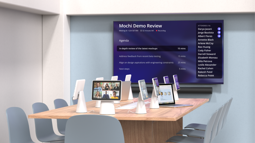
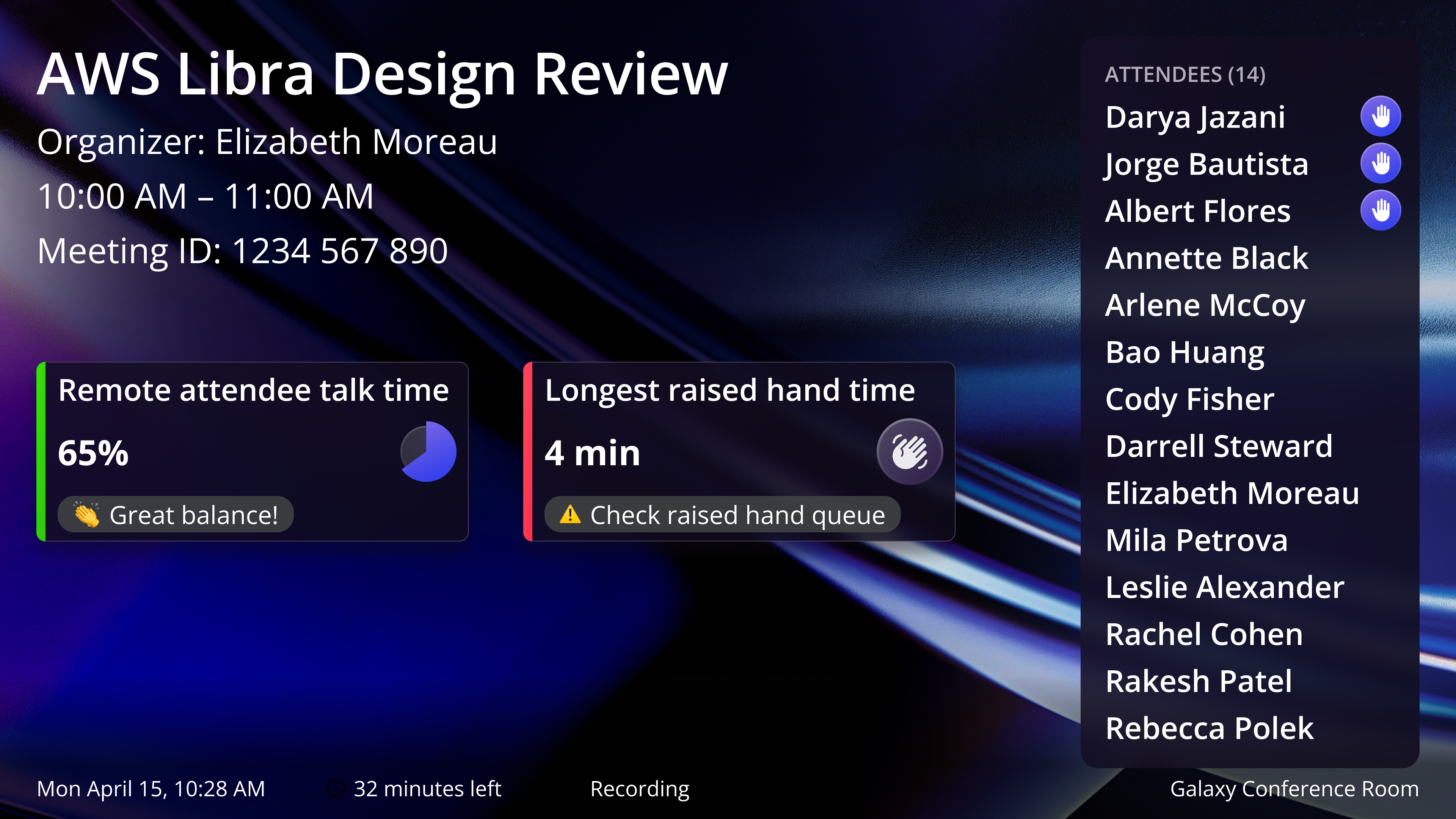
Libra was an S-team level bet to fix this. The system includes tablets at each seat, room TVs, and integrations with Zoom, Teams, and Chime. From 2022 to 2025, it was deployed across 477+ meetings with 3,151 participants.
"This is better than our OP1 executive rooms. Can we deploy in all leadership spaces?"
"If I were doing a document review tomorrow, I'd want to do it in a Libra room."
The Problem
Hybrid meetings create two completely different experiences, and neither side is well served.
Remote participants are invisible
- Can't read body language or see who's reacting
- Can't tell who's speaking when voices overlap
- Routinely talked over or forgotten mid-conversation
In-room participants have their own friction
- Joining from a personal laptop creates echo for everyone
- Sharing a single room mic means audio drops when the speaker turns away
- Room layout forces everyone to face one direction, making natural conversation impossible
Libra's goal was to bring equity to the room: making hybrid meetings equally fair, clear, and comfortable for everyone, regardless of where they're sitting.
Design tenets that guided every decision:
What I Delivered
High fidelity designs
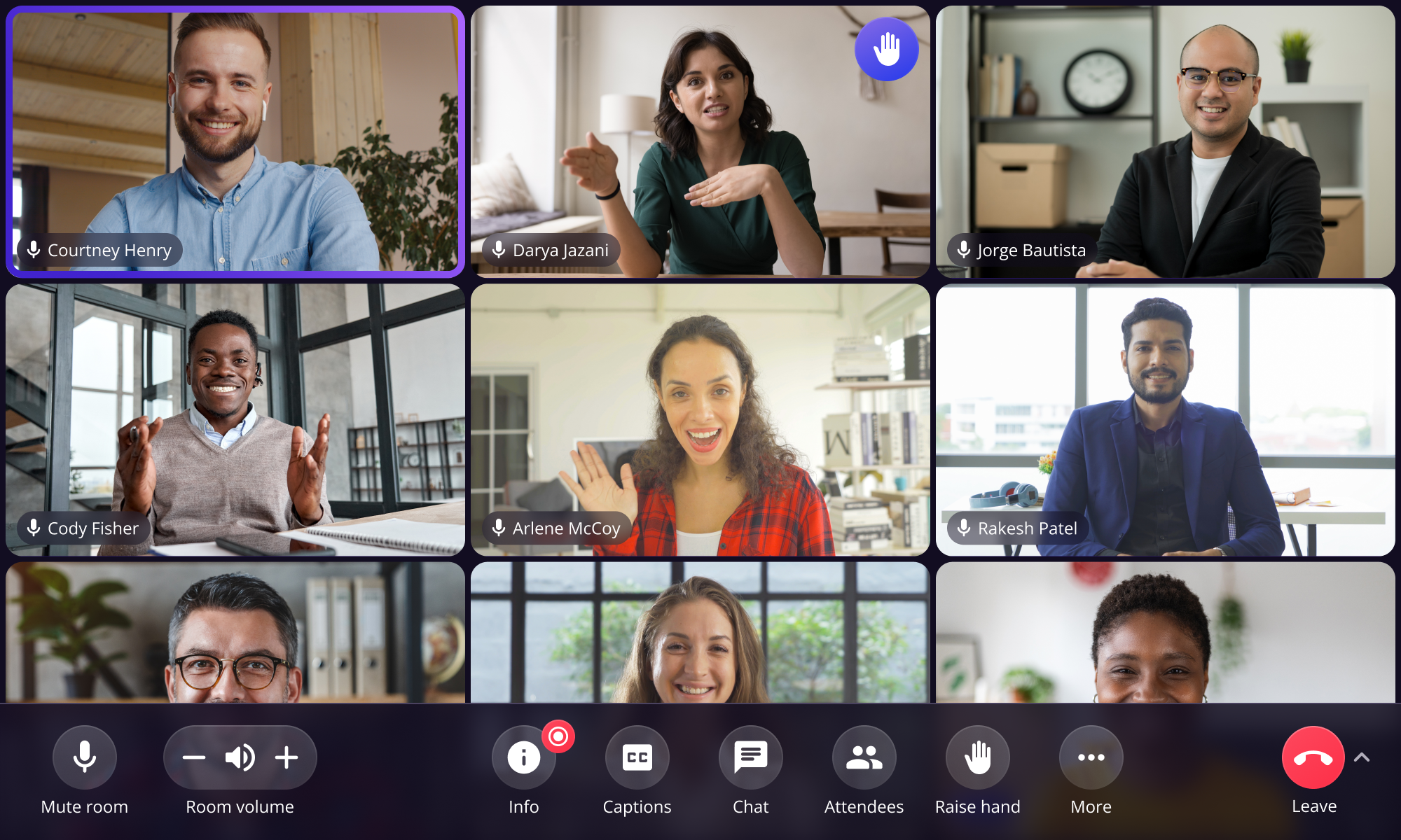
End-to-end across join flow, in-meeting, and exit. Built responsive components and user flows for tablet and TV.
User research
40+ in-person usability tests. Ran large-scale surveys (N=491). Research directly shaped product strategy at the leadership level.
Accessibility
Designed for neurodiverse users, low vision, deaf and hard of hearing participants. Ran accessibility testing with real users. 100% of accessibility participants preferred Libra over traditional conference rooms.
Design system
400+ responsive components across all surfaces, defined the grid system. Single source of truth for design and engineering.
What Users Said
As someone in visual design that is often content sharing as a presenter, I can't tell you the number of times that people ask me to zoom in on one thing while another tells me to zoom elsewhere. With this pinch to zoom feature on individual tablets, meeting participants can clearly see and focus on their content.
The tablet feels more natural- it focuses the conversation more organically at the table and makes it feel easier to hear the remote people so it's more cohesive.
It's really cool. If I came to this room, I wouldn't need to bring my computer.
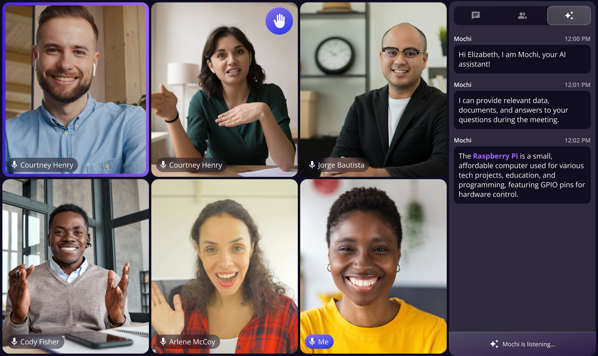
AI Meeting Assistant
In early 2025, before AI meeting assistants became mainstream, we were among the first to ship one. I had 2 months, real privacy concerns from users, and no playbook for ambient AI in a multi-device meeting room.
Research (N=129): The top user needs, meeting summarization (84%) and action items (83%), were both passive. Users wanted AI working in the background, not interrupting the meeting. This validated our Low Touch principle and anchored every design decision that followed.
Three Directions Explored
I explored three approaches. Each tested a different hypothesis about where AI belongs in a meeting room.
Industry-standard sidebar. Low distraction, but felt like a chatbot, not ambient. Contradicted our low-touch tenet.
 Leadership push
Highly visible, but competed with video. Neurodiverse testing showed 40% higher cognitive load.
 Shipped
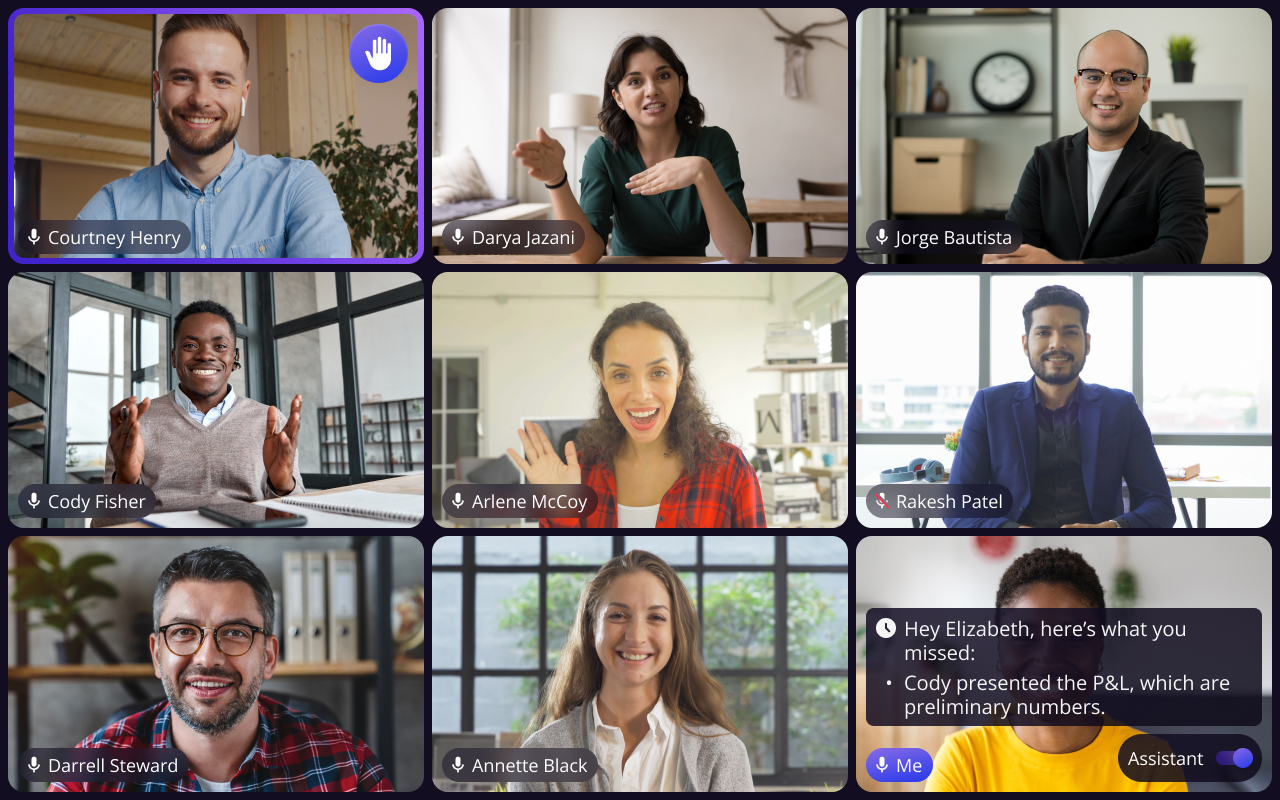
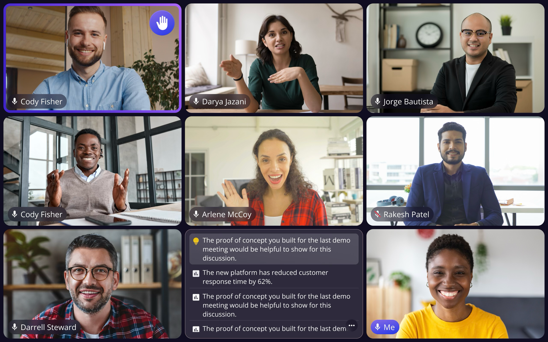
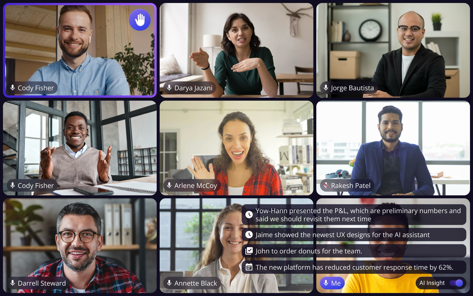
User-controlled, draggable, ambient. Gave people AI when they wanted it without competing for attention.
I pushed back. Neurodiverse testing showed 40% higher cognitive load with the dedicated tile. One participant said, "I can't focus on both." The tile competed with the very thing users came to the meeting for: other people. I presented the evidence alongside our design principles and proposed Option 3. Leadership agreed.
Final Design
After two rounds of iteration addressing clutter and video occlusion, the final version shipped to beta with catch-up insights, toggle controls, and seamless meeting navigation.
What I Learned
The hardest decisions weren't what AI should do, but what it should not do. Staying silent is a design choice.
I didn't debate opinions. I brought user data and direct quotes. Evidence made the conversation collaborative.
2 months, third-party dependencies, cross-platform. Every constraint forced a sharper decision.
Want the Full Story?
This covers the highlights. I'm happy to walk through the complete process, including research findings, design explorations, AI meeting assistant details, and key decisions, in a live conversation.
Request Full Case Study